About
OraQ uses AI and machine learning to offer dental practices the most competitive and innovative edge in the industry.
As a clinical decision support system, OraQ can radically improve treatment strategies without major practice upheaval by seamlessly integrating patient data, supplementary data and state-of-the-art imaging. OraQ’s sophisticated technological approach creates revolutionary new options for treatment opportunities and planning, as well as improved practice revenue. OraQ empowers dental professionals for superior patient care and redefines the holistic approach to healthcare.
Purpose
To achieve diagnostic excellence and empower patients to improve their overall wellness through a more holistic approach to healthcare.
Promise
Enjoy a more fulfilling career and do the dentistry you love.
Style & Tone
| BRAND STYLE | TONE OF VOICE |
|---|---|
| Healthy | Conversational, health tips |
| Genuine | Testimonials, first-hand experiences |
| Innovative | Confident, but not arrogant |
| Trusted | Official, factual tone. Helpful & educational messaging with evidence and proof points. Passionate, collaborative |
Visual Vocabulary

Image credit: Apple, Google, Asus Zenbo, Walt Disney, Marvel, Sony Pictures Releasing, Eon Productions, Metro-Goldwyn-Mayer Pictures, Columbia Pictures. Images should not be used, reproduced or sold without permission from original owners.
About the Logo

The OraQ logo uses lowercase typeface and soft, cool colours to personify a humble, confident and sophisticated company invested in offering practical solutions. The inclusion of the magnifying glass icon as the final letter of the company name strategically suggests the analytical, scientific approach the company employs to solve universal healthcare problems.
Logo Variations

The colour logo is best used in formats where it is able to stand alone, and is not competing with other design elements (images and text). This is the preferred logo variation and should be used whenever possible.

The partially reversed logo can be used in circumstances where the background allows for the coloured icon but requires knocked out text (dark backgrounds or dark photos).

The black version of the logo can be used as an alternative to the full colour logo in instances where colour reproduction is not possible.

The reversed version of the logo can
be used as an alternative to the full colour and partially reversed logo in instances where colour reproduction is not possible.
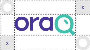
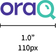
Clear Space & Minimum Size


Incorrect Logo Usage
 x DO NOT Alter Colours
 x DO NOT Remove Elements
 x DO NOT Reposition Elements
 x DO NOT Stretch or Skew
 x DO NOT Adjust Transparency
 x DO Not Add Any Effects
Colour
It is important to maintain the integrity of the colour scheme set out in this guideline. Below are the primary brand colours – with correct alternative values. The primary palette should be applied in all digital and print communications. OraQ Green should only be used for call outs, backgrounds and CTAs.
OraQ Indigo
- pms 2104C
- hex #483698
- rgb 72 / 54 / 152
- cmyk 89 / 93 / 0 / 0
OraQ Aqua Blue
- pms 7465C
- hex #40C1AC
- rgb 64 / 193 / 172
- cmyk 65 / 0 / 38 / 0
OraQ Green
- pms 2300C
- hex #A9C23F
- rgb 169 / 194 / 63
- cmyk 36 / 0 / 87 / 2
Typography
A standardized font system has been established for all brand communications.
Wherever possible, the primary typeface should be chosen for all digital communications. For instances where the primary typeface is not suitable for use, i.e. email templates etc, an alternative typeface is a suitable option and should be available to all users as a standard system font. The typeface families can be utilized in their various weights. Please refer to the following section for styling.
Bitter Semi-Bold
a b c d e f g h i j k l m n o p q r s t u v w x y z
A B C D E F G H I J K L M N O P Q R S T U V X Y Z
0 1 2 3 4 5 6 7 8 9 ! @ # $ % & *
Use me for main headlines.
Source Sans Pro Bold
a b c d e f g h i j k l m n o p q r s t u v w x y z
A B C D E F G H I J K L M N O P Q R S T U V X Y Z
0 1 2 3 4 5 6 7 8 9 ! @ # $ % & *
Use me in subtitles. I should always be in OraQ indigo and in Uppercase.
Source Sans Pro Regular
a b c d e f g h i j k l m n o p q r s t u v w x y z
A B C D E F G H I J K L M N O P Q R S T U V X Y Z
0 1 2 3 4 5 6 7 8 9 ! @ # $ % & *
Use me in body copy and any long form content like news articles, blog posts and general content.
Icons
A collection of icons were developed to illustrate the benefits of OraQ. They can be used on internal and external communications. Below are some examples.
![]()
These guidelines are the brands digital blueprint and contains all components that defines who we are, and set us apart from our competition. By honouring these guidelines, you’ll ensure that our brand maintains a consistent style. If there are any additional questions about usage that were not covered in these guidelines, please contact an approved brand manager.